Bootstrap 1 What Bootstrap is the most popular
Bootstrap 1

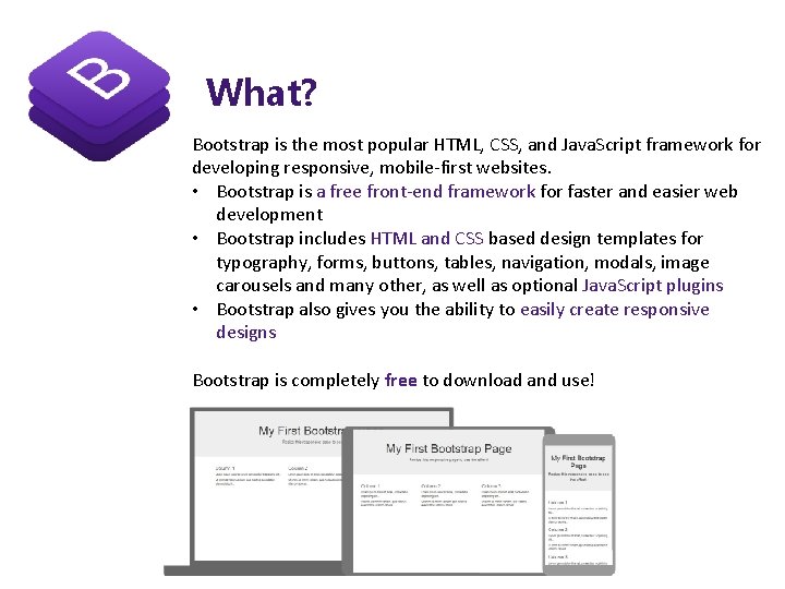
What? Bootstrap is the most popular HTML, CSS, and Java. Script framework for developing responsive, mobile-first websites. • Bootstrap is a free front-end framework for faster and easier web development • Bootstrap includes HTML and CSS based design templates for typography, forms, buttons, tables, navigation, modals, image carousels and many other, as well as optional Java. Script plugins • Bootstrap also gives you the ability to easily create responsive designs Bootstrap is completely free to download and use!

What? • Bootstrap was developed by Mark Otto and Jacob Thornton at Twitter, and released as an open source product in August 2011 on Git. Hub. • In June 2014 Bootstrap was the No. 1 project on Git. Hub! https: //github. com/sknida/advweb
Why Use Bootstrap? Advantages of Bootstrap: • Easy to use: Anybody with just basic knowledge of HTML and CSS can start using Bootstrap • Responsive features: Bootstrap's responsive CSS adjusts to phones, tablets, and desktops • Mobile-first approach: In Bootstrap 3, mobile-first styles are part of the core framework • Browser compatibility: Bootstrap is compatible with all modern browsers (Chrome, Firefox, Internet Explorer, Edge, Safari, and Opera)
Where to Get Bootstrap? There are two ways to start using Bootstrap on your own web site. • Download Bootstrap from getbootstrap. com • Include Bootstrap from a CDN <!-- Latest compiled and minified CSS --> <link rel="stylesheet" href="https: //maxcdn. bootstrapcdn. com/bootstrap/3. 4. 0/css/bootstra p. min. css"> <!-- j. Query library --> <script src="https: //ajax. googleapis. com/ajax/libs/jquery/3. 4. 1/jquery. min. js">< /script> <!-- Latest compiled Java. Script --> <script src="https: //maxcdn. bootstrapcdn. com/bootstrap/3. 4. 0/js/bootstrap. min. js">< /scrip t>
Create First Web Page With Boots 1. Add the HTML 5 doctype <!DOCTYPE html> <html lang="en"> <head> <meta charset="utf-8"> </head> </html> 2. Bootstrap 3 is mobile-first <meta name="viewport" content="width=device-width, initial-scale=1"> The width=device-width part sets the width of the page to follow the screenwidth of the device (which will vary depending on the device). The initial-scale=1 part sets the initial zoom level when the page is first loaded by the browser.
Create First Web Page With Boots 3. Containers 1. The. container class provides a responsive fixed width container 2. The. container-fluid class provides a full width container, spanning the entire width of the viewport <!DOCTYPE html> <html lang="en"> <head> <title>Bootstrap Example</title> <meta charset="utf-8"> <meta name="viewport" content="width=device-width, initial-scale=1"> <link rel="stylesheet" href="https: //maxcdn. bootstrapcdn. com/bootstrap/3. 4. 0/css/bootstrap. min. css"> <script src="https: //ajax. googleapis. com/ajax/libs/jquery/3. 4. 1/jquery. min. js"></script> <script src="https: //maxcdn. bootstrapcdn. com/bootstrap/3. 4. 0/js/bootstrap. min. js"></script> </head> <body> <div class="container"> <h 1>My First Bootstrap Page</h 1> <p>This is some text. </p> </div> </body> </html>

Create First Web Page With Boots 3. Containers 1. The. container class provides a responsive fixed width container 2. The. container-fluid class provides a full width container, spanning the entire width of the viewport <!DOCTYPE html> <html lang="en"> <head> <title>Bootstrap Example</title> <meta charset="utf-8"> <meta name="viewport" content="width=device-width, initial-scale=1"> <link rel="stylesheet" href="https: //maxcdn. bootstrapcdn. com/bootstrap/3. 4. 0/css/bootstrap. min. css"> <script src="https: //ajax. googleapis. com/ajax/libs/jquery/3. 4. 1/jquery. min. js"></script> <script src="https: //maxcdn. bootstrapcdn. com/bootstrap/3. 4. 0/js/bootstrap. min. js"></script> </head> <body> <div class="container-fluid"> <h 1>My First Bootstrap Page</h 1> <p>This is some text. </p> </div> </body> </html>
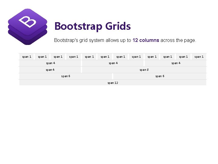
Bootstrap Grids Bootstrap's grid system allows up to 12 columns across the page. span 1 span 4 span 1 span 1 span 4 span 8 span 6 span 12 span 1
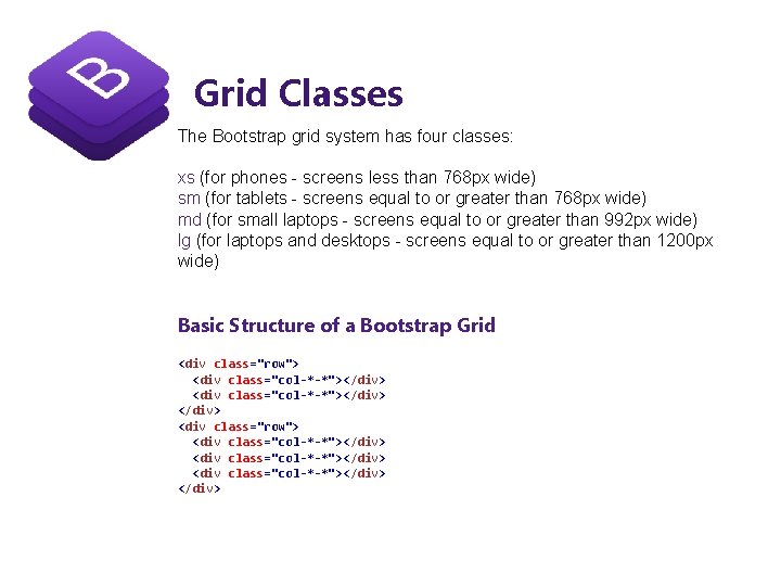
Grid Classes The Bootstrap grid system has four classes: xs (for phones - screens less than 768 px wide) sm (for tablets - screens equal to or greater than 768 px wide) md (for small laptops - screens equal to or greater than 992 px wide) lg (for laptops and desktops - screens equal to or greater than 1200 px wide) Basic Structure of a Bootstrap Grid <div class="row"> <div class="col-*-*"></div> <div class="row"> <div class="col-*-*"></div>
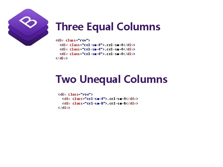
Three Equal Columns <div class="row"> <div class="col-sm-4">. col-sm-4</div> Two Unequal Columns <div class="row"> <div class="col-sm-4">. col-sm-4</div> <div class="col-sm-8">. col-sm-8</div>

Bootstrap Text/Typography Bootstrap's Default Settings Bootstrap's global default font-size is 14 px, with a line-height of 1. 428. This is applied to the <body> element and all paragraphs ( <p>). In addition, all <p> elements have a bottom margin that equals half their computed line-height (10 px by default). https: //www. w 3 schools. com/bootstrap_typography. asp

https: //www. w 3 schools. com/bootstrap_tables. asp Bootstrap Tables Bootstrap's Default Settings A basic Bootstrap table has a light padding and only horizontal dividers. The. table class adds basic styling to a table: tr class Table class <table class="table"> <table class="table-striped"> <table class="table-bordered"> <table class="table-hover"> <table class="table-condensed"> table-responsive <tr class="success"> <td>Success</td> <td>Doe</td> <td>john@example. com</td> </tr> <tr class="danger"> <td>Danger</td> <td>Moe</td> <td>mary@example. com</td> </tr> <div class="container"> <h 2>Table</h 2> <p>The. table-responsive class creates a responsive table: </p> <div class="table-responsive"> <table class="table">
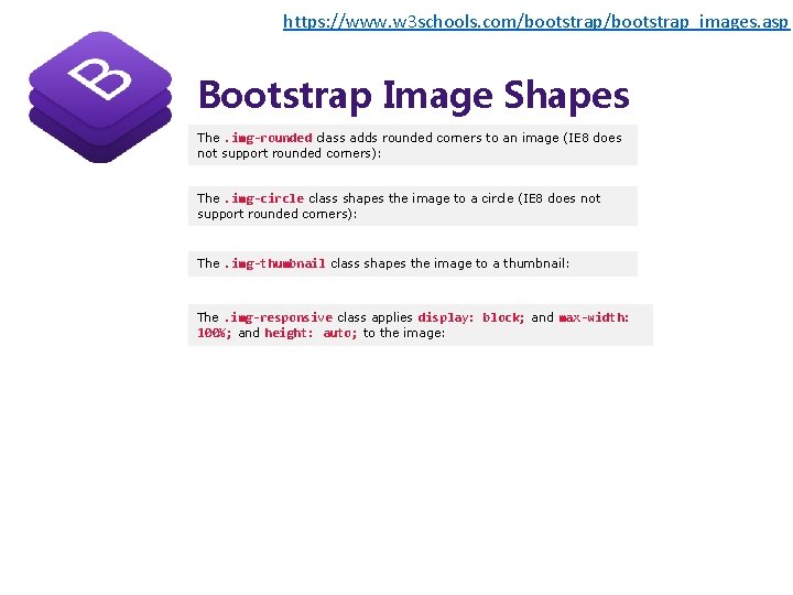
https: //www. w 3 schools. com/bootstrap_images. asp Bootstrap Image Shapes The. img-rounded class adds rounded corners to an image (IE 8 does not support rounded corners): The. img-circle class shapes the image to a circle (IE 8 does not support rounded corners): The. img-thumbnail class shapes the image to a thumbnail: The. img-responsive class applies display: block; and max-width: 100%; and height: auto; to the image:
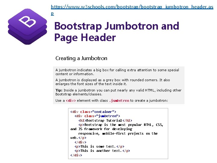
https: //www. w 3 schools. com/bootstrap_jumbotron_header. as p Bootstrap Jumbotron and Page Header Creating a Jumbotron A jumbotron indicates a big box for calling extra attention to some special content or information. A jumbotron is displayed as a grey box with rounded corners. It also enlarges the font sizes of the text inside it. Tip: Inside a jumbotron you can put nearly any valid HTML, including other Bootstrap elements/classes. Use a <div> element with class. jumbotron to create a jumbotron: <div class="container"> <div class="jumbotron"> <h 1>Bootstrap Tutorial</h 1> <p>Bootstrap is the most popular HTML, CSS, and JS framework for developing responsive, mobile-first projects on the web. </p> </div> <p>This is some text. </p> <p>This is another text. </p> </div>
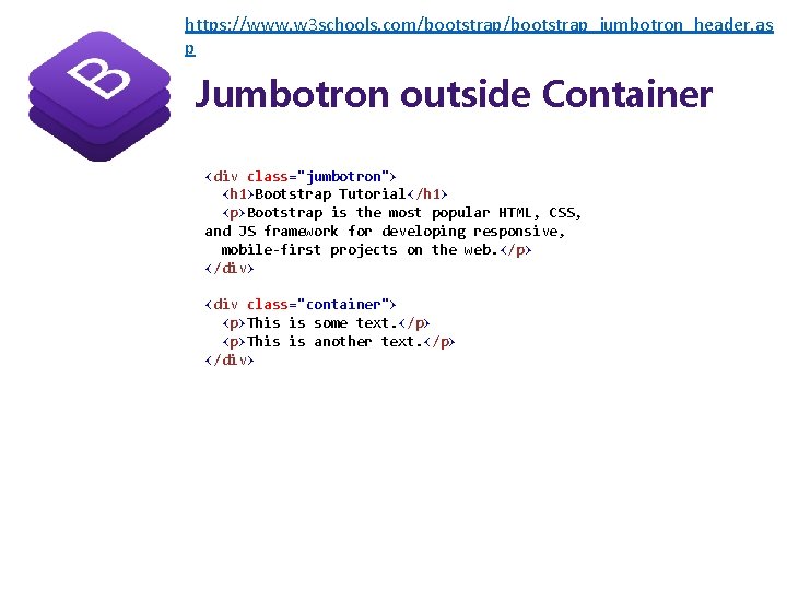
https: //www. w 3 schools. com/bootstrap_jumbotron_header. as p Jumbotron outside Container <div class="jumbotron"> <h 1>Bootstrap Tutorial</h 1> <p>Bootstrap is the most popular HTML, CSS, and JS framework for developing responsive, mobile-first projects on the web. </p> </div> <div class="container"> <p>This is some text. </p> <p>This is another text. </p> </div>
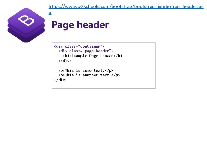
https: //www. w 3 schools. com/bootstrap_jumbotron_header. as p Page header <div class="container"> <div class="page-header"> <h 1>Example Page Header</h 1> </div> <p>This is some text. </p> <p>This is another text. </p> </div>
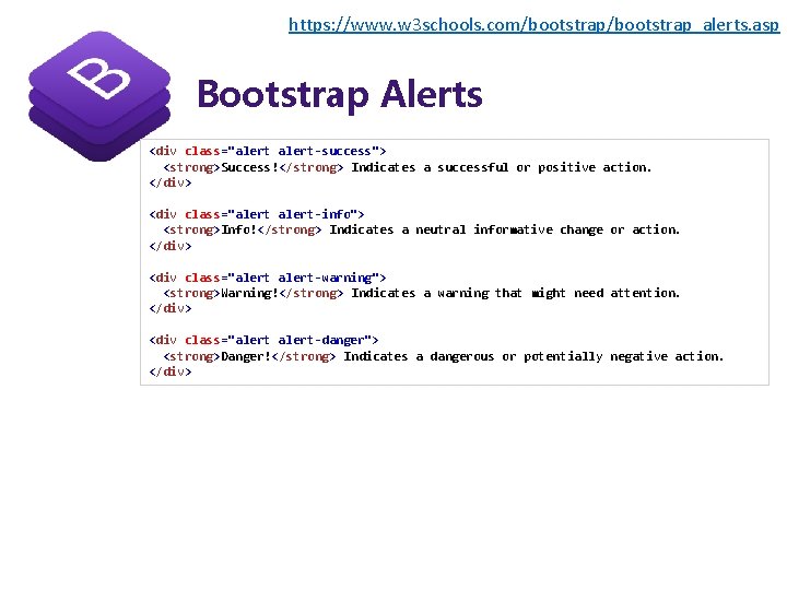
https: //www. w 3 schools. com/bootstrap_alerts. asp Bootstrap Alerts <div class="alert-success"> <strong>Success!</strong> Indicates a successful or positive action. </div> <div class="alert-info"> <strong>Info!</strong> Indicates a neutral informative change or action. </div> <div class="alert-warning"> <strong>Warning!</strong> Indicates a warning that might need attention. </div> <div class="alert-danger"> <strong>Danger!</strong> Indicates a dangerous or potentially negative action. </div>

https: //www. w 3 schools. com/bootstrap_buttons. asp Bootstrap Buttons To achieve the button styles, Bootstrap has the following classes: • . btn-default • . btn-primary • . btn-success • . btn-info • . btn-warning • . btn-danger • . btn-link <button <button type="button" type="button" class="btn">Basic</button> class="btn btn-default">Default</button> class="btn btn-primary">Primary</button> class="btn btn-success">Success</button> class="btn btn-info">Info</button> class="btn btn-warning">Warning</button> class="btn btn-danger">Danger</button> class="btn btn-link">Link</button>
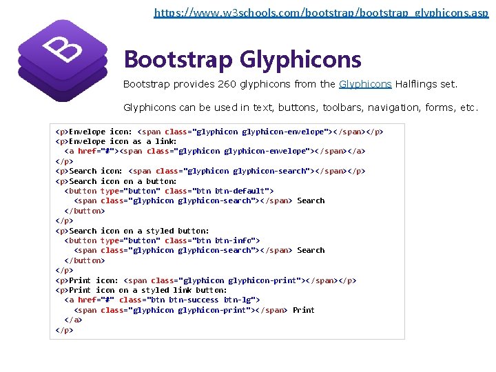
https: //www. w 3 schools. com/bootstrap_glyphicons. asp Bootstrap Glyphicons Bootstrap provides 260 glyphicons from the Glyphicons Halflings set. Glyphicons can be used in text, buttons, toolbars, navigation, forms, etc. <p>Envelope icon: <span class="glyphicon-envelope">< /span></p> <p>Envelope icon as a link: <a href="#"><span class="glyphicon-envelope">< /span></a> </p> <p>Search icon: <span class="glyphicon-search"></span></p> <p>Search icon on a button: <button type="button" class="btn btn-default"> <span class="glyphicon-search"></span> Search </button> </p> <p>Search icon on a styled button: <button type="button" class="btn btn-info"> <span class="glyphicon-search"></span> Search </button> </p> <p>Print icon: <span class="glyphicon-print"></span></p> <p>Print icon on a styled link button: <a href="#" class="btn btn-success btn-lg"> <span class="glyphicon-print"></span> Print </a> </p>
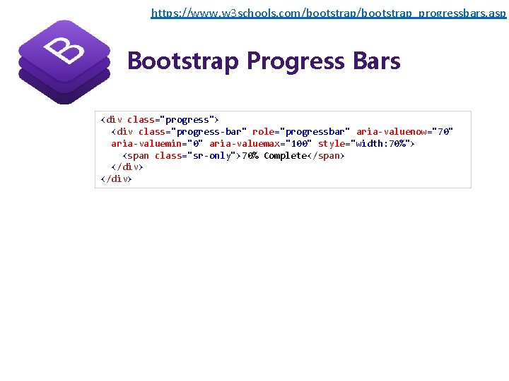
https: //www. w 3 schools. com/bootstrap_progressbars. asp Bootstrap Progress Bars <div class="progress"> <div class="progress-bar" role="progressbar" aria-valuenow="70" aria-valuemin="0" aria-valuemax="100" style="width: 70%"> <span class="sr-only">70% Complete</span> </div>
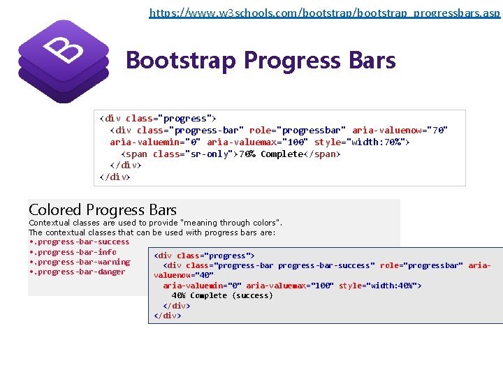
https: //www. w 3 schools. com/bootstrap_progressbars. asp Bootstrap Progress Bars <div class="progress"> <div class="progress-bar" role="progressbar" aria-valuenow="70" aria-valuemin="0" aria-valuemax="100" style="width: 70%"> <span class="sr-only">70% Complete</span> </div> Colored Progress Bars Contextual classes are used to provide "meaning through colors". The contextual classes that can be used with progress bars are: • . progress-bar-success • . progress-bar-info • . progress-bar-warning • . progress-bar-danger <div class="progress"> <div class="progress-bar-success" role="progressbar" ariavaluenow="40" aria-valuemin="0" aria-valuemax="100" style="width: 40%"> 40% Complete (success) </div>
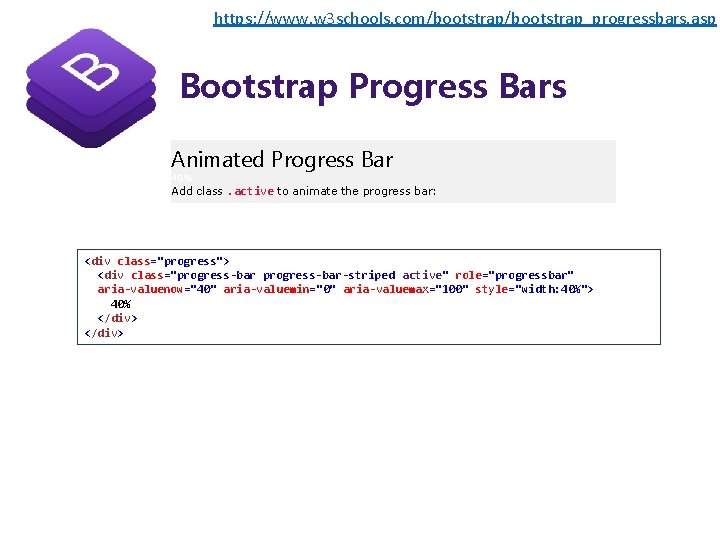
https: //www. w 3 schools. com/bootstrap_progressbars. asp Bootstrap Progress Bars Animated Progress Bar 40% Add class. active to animate the progress bar: <div class="progress"> <div class="progress-bar-striped active" role="progressbar" aria-valuenow="40" aria-valuemin="0" aria-valuemax="100" style="width: 40%"> 40% </div>
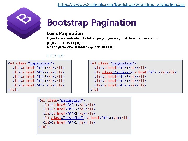
https: //www. w 3 schools. com/bootstrap_pagination. asp Bootstrap Pagination Basic Pagination If you have a web site with lots of pages, you may wish to add some sort of pagination to each page. A basic pagination in Bootstrap looks like this: 12345 <ul class="pagination"> <li><a href="#">1</a></li> <li><a href="#">2</a></li> <li><a href="#">3</a></li> <li><a href="#">4</a></li> <li><a href="#">5</a></li> </ul> <ul class="pagination"> <li><a href="#">1</a></li> <li class="active"><a href="#">2</a></li> <li><a href="#">3</a></li> <li><a href="#">4</a></li> <li><a href="#">5</a></li> </ul> <ul class="pagination"> <li><a href="#">1</a></li> <li><a href="#">2</a></li> <li><a href="#">3</a></li> <li class="disabled"><a href="#">4</a></li> <li><a href="#">5</a></li> </ul>

https: //www. w 3 schools. com/bootstrap_pagination. asp Bootstrap Pagination Basic Pagination If you have a web site with lots of pages, you may wish to add some sort of pagination to each page. A basic pagination in Bootstrap looks like this: 12345 <ul class="pagination"> <li><a href="#">1</a></li> <li><a href="#">2</a></li> <li><a href="#">3</a></li> <li><a href="#">4</a></li> <li><a href="#">5</a></li> </ul> <ul class="pagination"> <li><a href="#">1</a></li> <li class="active"><a href="#">2</a></li> <li><a href="#">3</a></li> <li><a href="#">4</a></li> <li><a href="#">5</a></li> </ul> <ul class="pagination"> <li><a href="#">1</a></li> <li><a href="#">2</a></li> <li><a href="#">3</a></li> <li class="disabled"><a href="#">4</a></li> <li><a href="#">5</a></li> </ul>
- Slides: 29